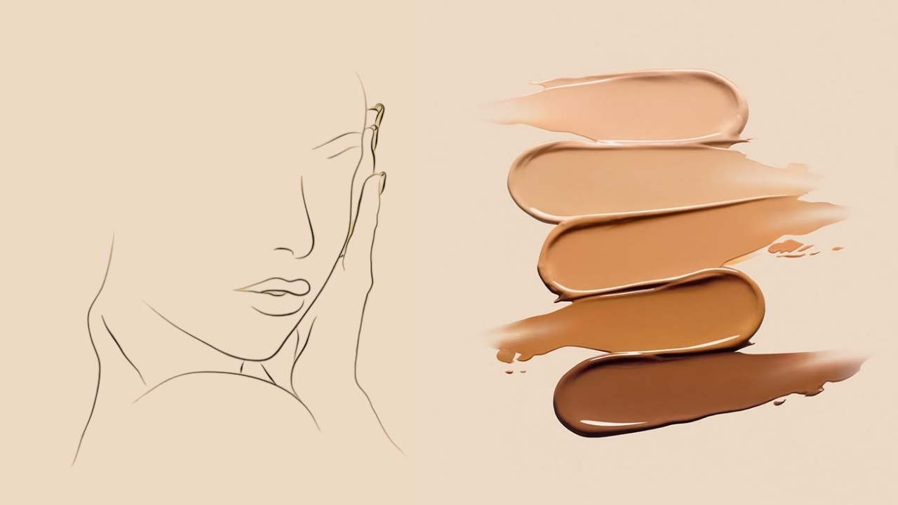
Finding the right foundation shade is the single most frustrating step in any makeup routine — and nine times out of ten, the problem is not the shade depth. It is the undertone. You can pick the perfect light-medium or the perfect deep, but if the undertone is wrong, the foundation will look orange, pink, ashy, or like it is sitting on top of your skin instead of melting into it. I have matched thousands of foundation shades throughout my career, and I can tell you this: once you understand your undertone, every other product choice — blush, bronzer, concealer, even lipstick — suddenly clicks into place. This guide will teach you exactly how to find your skin undertone using five proven at-home tests, how to apply that knowledge to foundation shopping, and how to fix the most common undertone mistakes that make people give up on foundation entirely.
What Is a Skin Undertone (and How Is It Different from Skin Tone)?
Before you can find your undertone, you need to understand what it actually is — because most people confuse it with skin tone, and that confusion is where shade-matching goes wrong.
Skin tone (also called surface color or depth) is the color you see when you look in the mirror. It is how light or dark your skin appears — fair, light, medium, tan, dark, or deep. Skin tone changes with sun exposure, seasons, hormones, and age.
Undertone is the color beneath the surface. It is the subtle hue that stays constant no matter how much you tan, how much redness you have from the sun, or how much your surface color shifts between winter and summer. Think of it like this: skin tone is the paint on a wall, and undertone is the primer underneath — it influences how every color on top of it looks, even though you cannot always see it directly.
This distinction matters enormously for foundation because two people can have the exact same shade depth — both "medium" — but completely different undertones. One might be warm (golden-yellow) and the other cool (pink-red). Put the same foundation on both of them and it will look flawless on one and completely wrong on the other.
There is also a fourth undertone that most guides leave out entirely: olive. Olive undertone means your skin has a greenish or gray-green cast that desaturates colors placed on top of it. Olive is not its own category separate from warm, cool, or neutral — it layers on top. You can be a warm olive, a cool olive, or a neutral olive. This is why olive-skinned people often find that foundations look too orange, too pink, or just unnaturally bright on them — the green in their skin clashes with the saturated pigments in most foundations. If that sounds familiar, keep reading — the tests below will help you identify olive undertones specifically.
This is the single most useful diagnostic principle in color matching. The color that appears wrong tells you which direction to move on the color wheel.
Here is what that means in practice. The color wheel has opposites — colors directly across from each other are called complementary colors. When your skin clashes with a product, the clashing color gets amplified and becomes visible. That visible "wrong" color tells you exactly which direction to move:
Lipstick looks orange on you? Orange = warm pigments (red + yellow) clashing with your skin. You are NOT warm. Move toward cool — try pink, mauve, or berry nudes instead.
Foundation looks pink? Too much red + white for your skin. You are NOT cool. Move toward warm — try golden or yellow-toned shades.
Blush looks unnaturally bright? Saturated pigments fighting the green in your skin. You likely have olive undertones. Move toward muted, desaturated shades — dusty rose, soft terracotta.
Foundation looks gray or ashy? Too much blue-black pigment. Move toward warmer shades with more yellow and less depth.
The rule: Colors opposite each other on the wheel cancel out. Whatever color appears wrong on your skin = the color you are NOT. Go in the opposite direction to find your match.
The Science Behind Foundation Pigments (Why Wrong Undertones Happen)
Here is something most people never learn: every complexion product on the market — every foundation, concealer, and tinted moisturizer — is mixed using only four base pigments: black, white, red, and yellow. That is it. Every shade you have ever seen in a Sephora display was created by combining these four pigments in different ratios.
The critical detail is that the "black" pigment used in cosmetics is not true black — it is actually a very deep blue. This is why foundations that are too dark for your skin tone often look grayish or ashy rather than just darker. The blue pigment is pulling through.
Understanding this explains every foundation mismatch you have ever experienced:
- Foundation turns pink on you? It has too much red + white pigment for your skin. You need to move warmer.
- Foundation turns yellow? Too much yellow pigment. You need to move cooler or more neutral.
- Foundation turns orange? Too much red + yellow. You need a cooler or more muted shade.
- Foundation looks gray or ashy? Too much of the blue-black pigment relative to your skin. You need a shade with more warmth and less depth, or with different undertone balance.
This is literally paint mixing — the same principles artists use on a canvas. Once you understand that foundation is just four pigments blended together, diagnosing what went wrong becomes straightforward: whatever color the foundation turns on your skin is the color you are NOT. Go in the opposite direction on the color wheel.
5 At-Home Tests to Find Your Skin Undertone
No single test is definitive on its own. Think of these as five pieces of evidence — the more tests that point in the same direction, the more confident you can be. I recommend doing all five and looking for patterns.
How to do it: Look at the veins on the inside of your wrist and inner arm in natural daylight. Do NOT stretch the skin — just let your arm rest naturally and observe the color.
Reading the results:
• Green veins = warm undertone (golden, yellow)
• Blue or purple veins = cool undertone (pink, red)
• Mix of blue-green veins = neutral undertone
• Teal or blue-green with a grayish cast = possible olive undertone
Why it works: Your veins are blue — they carry deoxygenated blood. The color you see is your skin's pigment filtering the blue of the veins. Green veins mean your skin's yellow pigment is mixing with the blue. Purple veins mean your skin's pink pigment is amplifying the blue. It is a natural color filter test.
Important caveat for deeper skin tones: If your veins are difficult to see on your wrist, look at the veins on your neck just below the jawline, or the inside of your lower lip. These areas have thinner skin and are less affected by melanin density.
How to do it: Hold a plain white piece of paper (or a white t-shirt) next to your bare face in natural light. White is a perfectly neutral color, so it forces the colors in your skin to become more visible by contrast.
Reading the results:
• Your skin looks yellowish or golden next to the paper = warm
• Your skin looks pinkish or rosy next to the paper = cool
• Your skin looks grayish or greenish next to the paper = olive
• You genuinely cannot tell = likely neutral
Why it works: The white provides a neutral reference point, similar to how photographers use a white balance card. It eliminates ambient color pollution so your skin's inherent undertone becomes more visible.
How to do it: Swatch a warm-toned blush (peach, coral, warm pink) on one cheek and a cool-toned blush (berry, mauve, blue-pink) on the other. Look at which one blends more seamlessly into your skin versus which one stands out or looks "off."
Reading the results:
• Warm shades blend seamlessly and cool shades look jarring = warm undertone
• Cool shades blend seamlessly and warm shades look orange = cool undertone
• Both blend reasonably well = neutral undertone
• Both look unnaturally bright and desaturated/muted shades look better = olive undertone
The lipstick version: Try a nude lipstick that matches your skin depth. If it turns orange on your lips, you likely have a cool undertone (the warm pigments clash). If it turns purple or grayish, you likely have a warm undertone (the cool pigments clash). If it just looks like a nude — congratulations, you found your match.
Key principle: Whatever color a product turns on your skin is the color you are NOT. Use this to work backward toward your actual undertone.
How to do it: Hold a piece of gold jewelry against your skin, then silver. Notice which one makes your skin look more vibrant and alive versus which one makes it look washed out.
Reading the results:
• Gold looks more flattering = warm undertone
• Silver looks more flattering = cool undertone
• Both look equally good = neutral undertone
Honesty check: This test has a major weakness — personal preference. Many people choose the metal they already like rather than the one that objectively harmonizes with their skin. It works best when someone else evaluates for you, removing the bias of personal taste. I rate this the least reliable of the five tests for exactly this reason.
How to do it: Think about what happens to your skin after moderate sun exposure (not sunburn — just regular time outdoors).
Reading the results:
• You tan easily and develop a golden or bronze glow = warm undertone
• You burn first, then tan slightly, or you develop a pinkish flush = cool undertone
• You tan moderately without strong golden or pink tones = neutral
• You tan into an olive or greenish-brown = olive undertone
Why it works: UV exposure triggers melanin production, and the type of melanin your body produces (eumelanin vs pheomelanin) is directly related to your underlying pigment composition — which is exactly what undertone describes.
See these tests demonstrated step by step:
How to Find Your Undertone on Dark and Deep Skin
Standard undertone tests were designed with lighter skin in mind, and this is a problem the beauty industry has been slow to fix. The vein test is harder when melanin density is higher. The white paper test can be ambiguous. And the sun test is less useful when you rarely burn. But dark and deep skin absolutely has undertone variation — in fact, getting undertone right is even more critical at deeper shade depths because the wrong undertone creates a more visible mismatch.
Here are adapted approaches that work better for deeper skin:
Look at less sun-exposed areas. The inside of your arm, the skin behind your ear, and the underside of your jaw are shielded from UV exposure and show your true undertone with less interference from surface tanning or hyperpigmentation. Compare these areas to your face — the difference tells you how much your surface color has shifted.
Check the inside of your lower lip. Pull down your bottom lip gently and look at the inner skin. This area has almost no melanin and reveals your underlying pigment clearly. Pink-red tones suggest cool. Salmon or peach tones suggest warm. A brownish or muted tone can suggest olive or neutral.
Use the foundation elimination method. Go to a Sephora, Ulta, or department store and swatch three foundations in your shade depth — one labeled warm, one cool, one neutral. Swatch them from mid-cheek down to mid-neck. Let them dry for two full minutes (foundation looks completely different wet versus dry). The one that "disappears" into your skin is your match. The ones that do not match will tell you what you are NOT — if the warm shade looks orange, your undertone leans cooler, and vice versa.
Match the depth, not the redness. Many people with dark skin have redness on their cheeks from sun sensitivity or irritation. This redness is NOT your undertone — it is surface-level. Match your foundation to the neck and jaw area where redness is minimal.
Watch how pros match deeper skin tones:
How to Match Foundation to Your Undertone
Now that you know your undertone, here is how to translate that knowledge into finding your perfect foundation shade. This is where theory meets practice.
Step 1: Determine Your Shade Depth
Before undertone, nail your depth category: fair, light, light-medium, medium, medium-tan, tan, dark, or deep. This is usually the easy part — you can generally tell at a glance which neighborhood you fall into.
Step 2: Decode Foundation Shade Labels
Every brand labels undertones differently, and this inconsistency causes massive confusion. Here is a cheat sheet:
- W = Warm (golden, yellow) at most brands
- C = Cool (pink, red) at most brands
- N = Neutral (balanced)
- O = Olive (at brands that offer it)
Critical exception: MAC and Haus Labs reverse the system. At MAC, "NC" stands for "Neutral Cool" but is actually their warm/yellow-toned range. "NW" stands for "Neutral Warm" but is actually their cool/pink-toned range. This confuses everyone. If you are warm-toned and shopping at MAC, you want NC shades. If you are cool-toned, you want NW. Yes, it is backward. Yes, it trips up even experienced makeup buyers.
For drugstore brands that use shade names instead of codes (like "porcelain," "sandy beige," "toffee"), check the brand's website. Most list the undertone for each shade in the product description online even though it is not on the bottle. L'Oreal True Match is the gold standard here — every shade is clearly coded by undertone (e.g., W4 = warm light medium golden). Or skip the label decoding entirely and use our Shade Matcher — it does the cross-brand translation for you.
Step 3: Swatch in the Right Place
Where you swatch makes or breaks your match. Here is what most people get wrong:
Never swatch on the back of your hand. Your hands get more sun exposure than your face, the knuckles are a different color, and the skin texture is completely different. This is the most common swatching mistake.
Never swatch on the inside of your arm. It is too pale and does not represent your facial skin at all.
The correct swatch zone: Start at mid-cheek, sweep down along your jawline, and continue about halfway down your neck. This transition area is where foundation needs to blend seamlessly, so it is where you should test it. The shade that disappears into this zone — where you literally cannot see the edge — is your match.
Always swatch 3-4 shades in your depth range. Pick one warm, one cool, and one neutral. You are looking for the one that "does not react" — the shade that just sits there without shifting color. If a shade turns pink, orange, or gray on your skin after drying, eliminate it.
Step 4: Let It Dry and Check in Natural Light
This step is non-negotiable and it is where most people skip ahead and make bad decisions.
Wait at least two full minutes after swatching before evaluating. Foundation oxidizes as it dries — the shade you see wet is not the shade you will wear. Some foundations shift dramatically (especially drugstore formulas with higher iron oxide content), so the dried-down version is the only one that matters.
Step outside. Store lighting is designed to sell products, not to accurately represent color. Overhead fluorescents cast shadows that distort shade perception. Ask for a handheld mirror at Sephora or Ulta, walk outside, and evaluate your swatches in direct daylight. Take a photo on your phone if you want to compare later — phone cameras in daylight are surprisingly accurate for foundation matching.
Pro tip: If you cannot decide between two shades in store, ask for samples. Sephora, Ulta, Nordstrom, and most department store counters will give you sample cups to take home. Wear each shade for a full day and evaluate in multiple lighting conditions before committing.
Skip the store trip entirely: If you already know one shade that works for you, our Shade Matcher tool will find the closest matches across every brand in the database — so you can build a shortlist before you ever set foot in a store.
Watch the swatch technique in action:
Best Foundations by Undertone Type
Not all foundations are created equal when it comes to undertone range. Here are the best options depending on your undertone category:
For warm undertones: The Giorgio Armani Luminous Silk Foundation is the industry benchmark — its warm shades are perfectly golden without tipping into orange. At the drugstore level, the L'Oreal True Match Super Blendable Foundation has the best labeled warm shade range with clear W-codes on every bottle.
For cool undertones: The Fenty Beauty Pro Filt'r Soft Matte Foundation with its 50+ shade range has some of the most precisely calibrated cool tones on the market — Rihanna specifically developed it to solve the "everything looks orange on me" problem. The MAC Studio Fix Fluid Foundation is another strong choice, but remember: MAC's "NW" (neutral warm) range is actually the cool/pink range.
For neutral undertones: You have the most flexibility. The Maybelline Fit Me Dewy + Smooth Foundation offers excellent neutral shades at a drugstore price. The NYX Total Control Pro Drop Foundation lets you mix shades drop by drop for a custom-blended neutral match.
For olive undertones: This is where the struggle is real. Most brands still do not make true olive shades, so you may need to mix. The LA Girl HD Pro Concealer set includes a green corrector that you can mix into any foundation to add that olive-green dimension that neutralizes the "too bright" problem. Start with one drop of green and build from there — a little goes a long way.
The Olive Undertone Deep Dive
Olive deserves its own section because it is the most misunderstood and underserved undertone in the beauty industry. If you have struggled to find foundation your entire life — if everything looks too orange, too pink, or just unnaturally vivid — there is a real chance you have an olive undertone that nobody told you about.
Olive skin has a greenish or grayish-green cast that desaturates any color placed on top of it. This means saturated products (bright blushes, vivid foundations, bold lip colors) tend to look garish or "off" against your skin, while muted, desaturated shades look harmonious and natural.
How to confirm olive undertone: Take a green color corrector or green mixing pigment and add a tiny drop to your best-matching foundation. If it suddenly looks like a perfect match — if the foundation goes from "close but not quite" to "that is my skin" — you have olive undertone. That green pigment is replacing the green dimension that was missing from the foundation formula.
Color theory for olive skin: Bright, highly saturated colors will wash you out because your skin's green cast conflicts with vivid pigments. Look for muted, desaturated, or "dusty" versions of every color — dusty rose instead of hot pink, burnt sienna instead of bright orange, mauve instead of fuchsia. Desaturated shades contain a touch of gray or brown that harmonizes with the gray-green in your skin.
The red lipstick hack: If every red lipstick looks wrong on you, mix a tiny amount of green corrector into it. Green and red are complementary colors on the color wheel — when they mix, they pull the shade toward brown/gray, which desaturates the red and makes it work with olive skin. The difference is dramatic.
If olive matching is your main struggle, we have a dedicated deep dive: Foundation for Olive Skin: Why It's So Hard to Match (and What Works).
Watch how olive undertone affects foundation matching:
Common Foundation Undertone Mistakes (and How to Fix Them)
"If my foundation looks orange after a few hours, it means I picked the wrong shade."
Tap to revealIt could be the wrong shade OR oxidation. Foundations with iron oxides darken and shift warmer as they react with your skin's oil and pH. Try a foundation with lower oxidation (silicone-based formulas oxidize less), or go one half-shade lighter and cooler to compensate. Read our full guide on foundation oxidation for prevention strategies.
"Your undertone can change with tanning, hormones, or age."
Tap to revealYour undertone never changes — it is determined by your genetics and pigment composition. What changes is your overtone (surface color). Tanning adds melanin to your surface, hormones can cause hyperpigmentation, and aging can make skin look more sallow. But the undertone beneath stays constant. You may need different foundation depths seasonally, but the undertone code should stay the same.
"You should match your foundation to your face for the most accurate result."
Tap to revealYour face has redness from blood vessels, sun damage, acne, and irritation — none of which are your undertone. The jawline-to-neck transition zone is the only accurate swatch location because it represents your true skin color without surface interference. Foundation should blend seamlessly from face to neck — if it matches your red cheeks, it will look like a mask at the jawline.
"Neutral undertone means you have no undertone — just regular skin."
Tap to revealNeutral does NOT mean "nothing." It means a balanced mix of warm and cool pigments. Two neutral-toned people can look very different from each other — one might lean slightly warm-neutral (golden beige) while another leans cool-neutral (pink beige). Neutral is a combination, not an absence.
More Mistakes to Avoid
Scratch each card to reveal common foundation mistakes and how to avoid them.
Testing foundation in store lighting
Fluorescent and warm spotlights in Sephora and Ulta are designed to make products look good on the shelf — not on your skin. Always step outside to evaluate.
Judging a shade by how it looks in the bottle
Foundations oxidize inside the bottle over time, and frosted or tinted glass distorts the color. What you see in the bottle is not what you will see on your skin. Always swatch.
Forgetting about drugstore return policies
If the shade is wrong, you can return opened foundations at CVS, Walgreens, Target, and Walmart. Do not suffer through a bad match — return it and try the next option.
Ignoring the compare-to-a-friend technique
One of the most underrated ways to see your own undertone is to hold your arm next to someone else's. Complementary colors pop when placed side by side — if your arm looks distinctly golden next to your friend's pink arm, that contrast makes undertone obvious in a way that staring at your own skin in isolation never will.
Beyond Foundation: How Undertone Affects Your Entire Makeup Look
Your undertone does not just dictate foundation shade — it influences every color product you use:
Blush: Warm undertones look best in peach, coral, and warm pink shades. Cool undertones glow in berry, mauve, and blue-pink shades. Olive undertones need desaturated or muted blushes — dusty rose, soft terracotta, or brownish pink shades that will not fight the green in your skin.
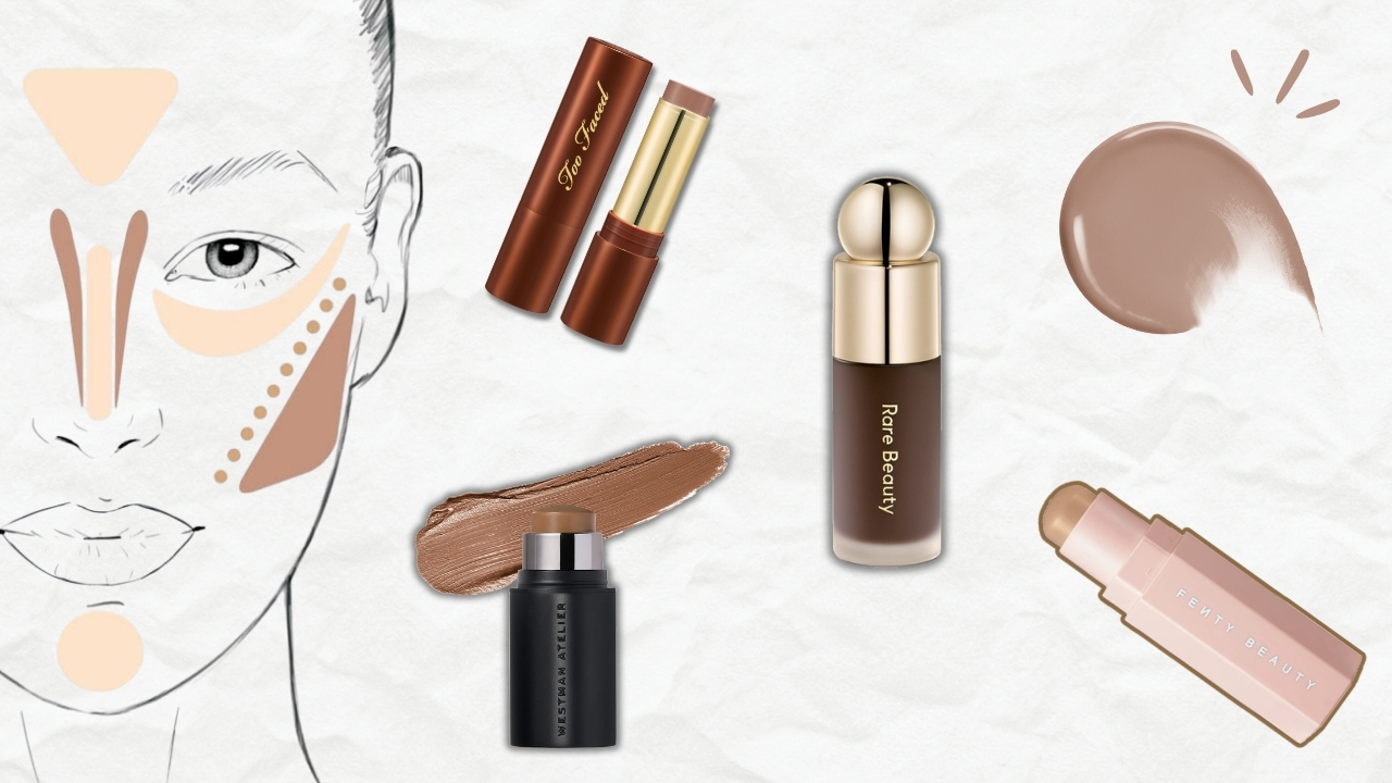
Bronzer and contour: Warm undertones can use golden and amber bronzers. Cool undertones should choose rose-bronze or cool brown shades to avoid looking muddy. Olive undertones look best in neutral-toned bronzers that lean slightly warm without being orange. Contour shade choice is just as undertone-dependent — our complete contouring tutorial walks through placement and shade selection for every face shape.
Highlighter: The same principle applies to highlight — a gold highlighter on cool skin looks jarring, while an icy silver highlight on warm skin can look ashy. Our highlighting guide covers how to pick the right tone for your skin.
Lipstick: The same nude lipstick looks completely different on warm versus cool skin. A "universal nude" will pull orange on cool skin and purple on warm skin. Choose nudes based on undertone — warm nudes for warm skin, pink or mauve nudes for cool skin, and muted brownish nudes for olive skin.
Concealer: Match your concealer to your undertone the same way you match foundation. A yellow-toned concealer on cool skin under the eyes will look sallow. A pink-toned concealer on warm skin will look ashy.
Complementary colors (opposite on the wheel) cancel each other out. Use green corrector to neutralize redness. Use peach/orange corrector to neutralize dark circles on warm skin. Use lavender corrector to neutralize sallowness on cool skin.
Many people need a summer shade and a winter shade — same undertone code, different depth. Mix them during transition seasons instead of buying a third bottle.
If your face and body are different depths (common after summer), use a neutral-toned bronzer on the perimeter of your face to blend the transition rather than matching foundation to the darker area.
If your foundation is close but not perfect, color corrector drops (green, blue, yellow) let you custom-mix the exact undertone adjustment. One drop of blue neutralizes orange. One drop of green adds olive dimension. It is literally paint mixing for your face.
Test Your Skin Undertone Knowledge
Test Your Undertone IQ
5 questions. How well do you really know this stuff?
Frequently Asked Questions About Skin Undertone
No. Your undertone is determined by your genetic pigment composition and stays constant throughout your life. What changes is your overtone — the surface color that shifts with tanning, hormones, aging, and seasonal sun exposure. You may need to adjust your foundation depth seasonally, but your undertone code (warm, cool, neutral, olive) remains the same.
A mix of blue and green veins typically indicates a neutral undertone — a balanced combination of warm and cool pigments. However, if you also notice a grayish or teal cast to your veins, you may have a neutral-olive undertone. Confirm by doing the other tests (blush test, white paper test) to see if the neutral result is consistent across methods.
Standard tests like the vein test can be harder on deeper skin because higher melanin density makes veins less visible. Instead, check veins on your neck below the jawline, examine the inside of your lower lip for pink (cool) vs. peach (warm) tones, and use the foundation elimination method — swatch warm, cool, and neutral shades from cheek to neck and see which one disappears into your skin.
This is usually caused by oxidation — a chemical reaction between the iron oxides in your foundation, your skin's natural oils, and your pH level. It can also mean the shade is too warm for your undertone. To fix it, try a silicone-based formula (which resists oxidation), go half a shade lighter and cooler, and always apply over a mattifying primer to reduce oil-triggered oxidation. We cover this in much more detail in our guide on why foundation looks orange and how to prevent oxidation.
Warm undertone means your skin has golden, yellow, or peachy hues beneath the surface. Olive undertone adds a green or gray-green dimension on top of your base undertone. You can be a warm olive (yellow-green), a cool olive (pink-green), or a neutral olive (balanced with green). The telltale sign of olive is that highly saturated colors look "off" on your skin while muted, desaturated shades look natural.
Neither in isolation — match to the transition zone between the two. Swatch from mid-cheek down the jawline to mid-neck. The goal is a seamless blend from face to neck with no visible line. Your face often has redness and uneven color that does not represent your true undertone, while your neck may be slightly lighter. The jawline zone splits the difference.
The Bottom Line: Your Undertone Is the Key to Everything
Finding your skin undertone is not just about foundation — it is the master key that unlocks every color decision in your makeup routine. Once you know whether you are warm, cool, neutral, or olive, every trip to Sephora becomes faster, every online shade match becomes more accurate, and every product you buy has a dramatically higher chance of working on your skin the first time.
Do all five tests. Look for the pattern. Trust the evidence your skin gives you — not what a label says, not what an online quiz guesses, and definitely not what a sales associate assumes in two seconds of overhead lighting. Your skin has been telling you its undertone every time a foundation turned orange or a lipstick went gray. Now you know how to listen.
The shade that disappears is the shade that was made for you.
Ready to put your undertone to work? Our Foundation & Concealer Shade Matcher lets you enter a shade you already wear and instantly see the closest matches across every brand in the database — filtered by undertone, depth, and product type. It is the fastest way to skip the guesswork and go straight to your shortlist.